Civoryn
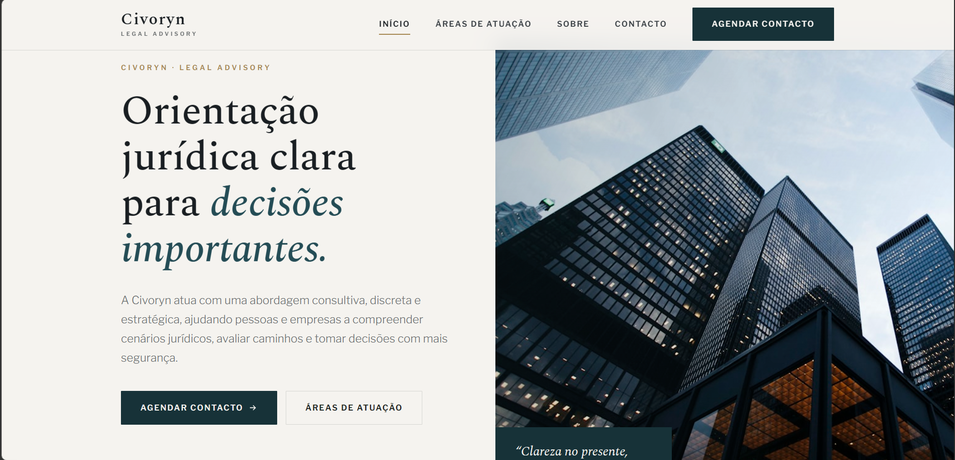
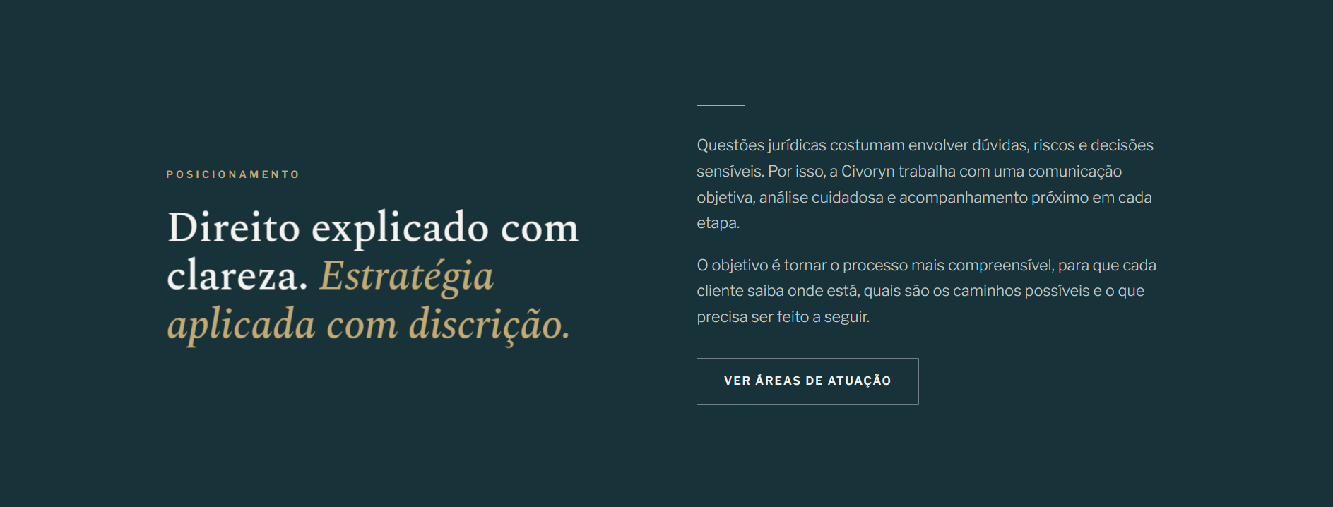
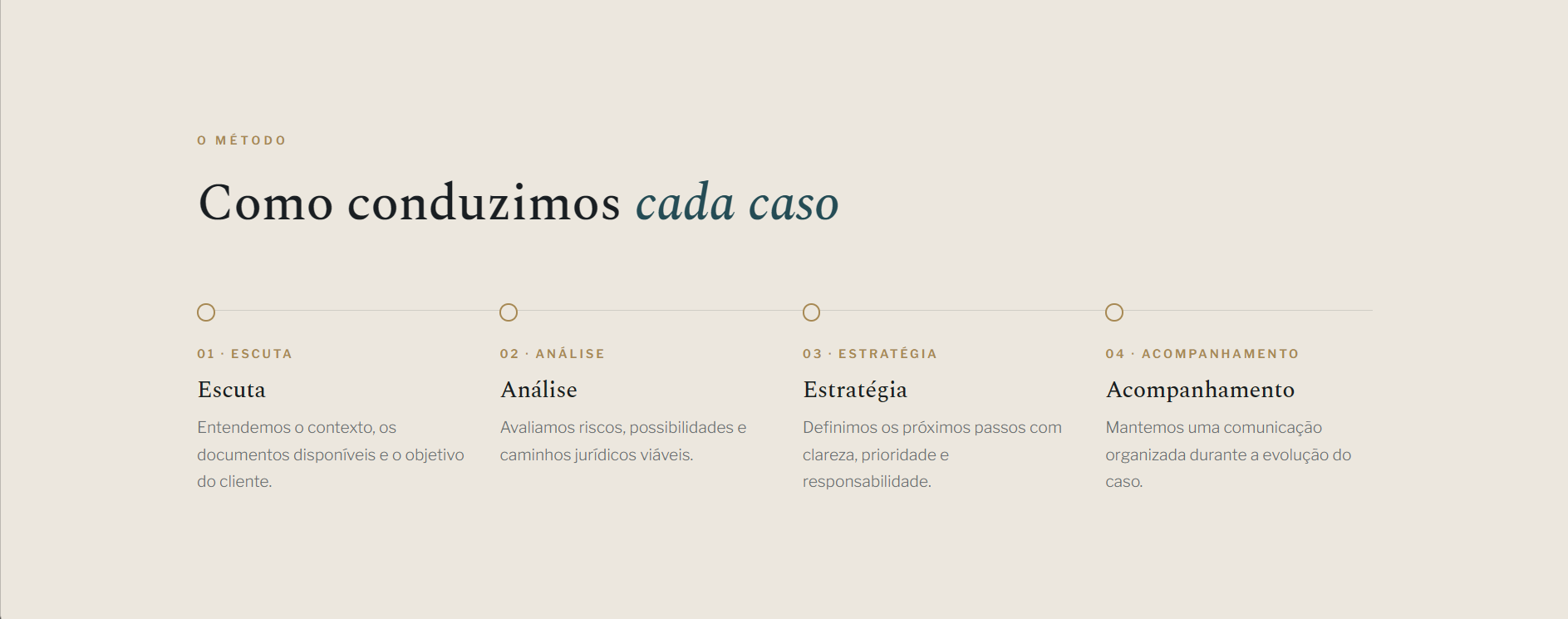
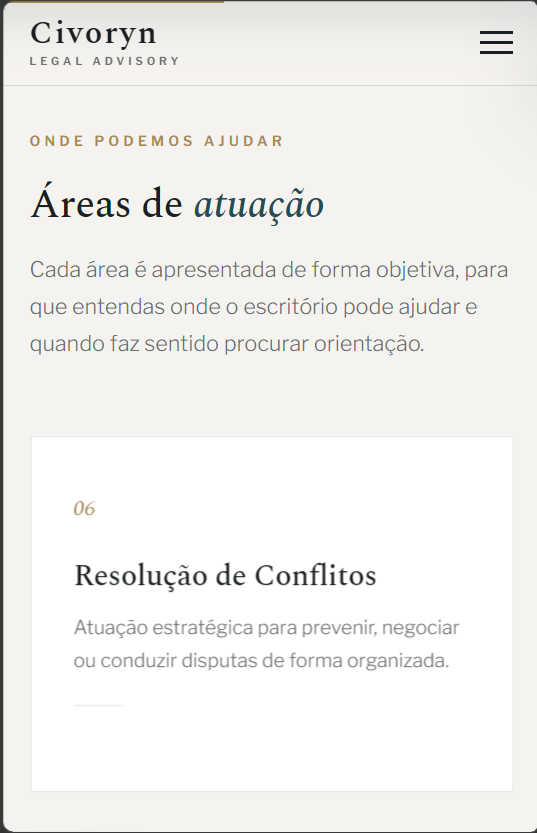
A 15-year-old firm with a visually dated website. A full redesign with editorial typography and bios built around representative cases.
The challenge
An old site with a 2010s layout. The quality didn't match the seniority of the team. Partners felt awkward sharing it.
Approach
Web development
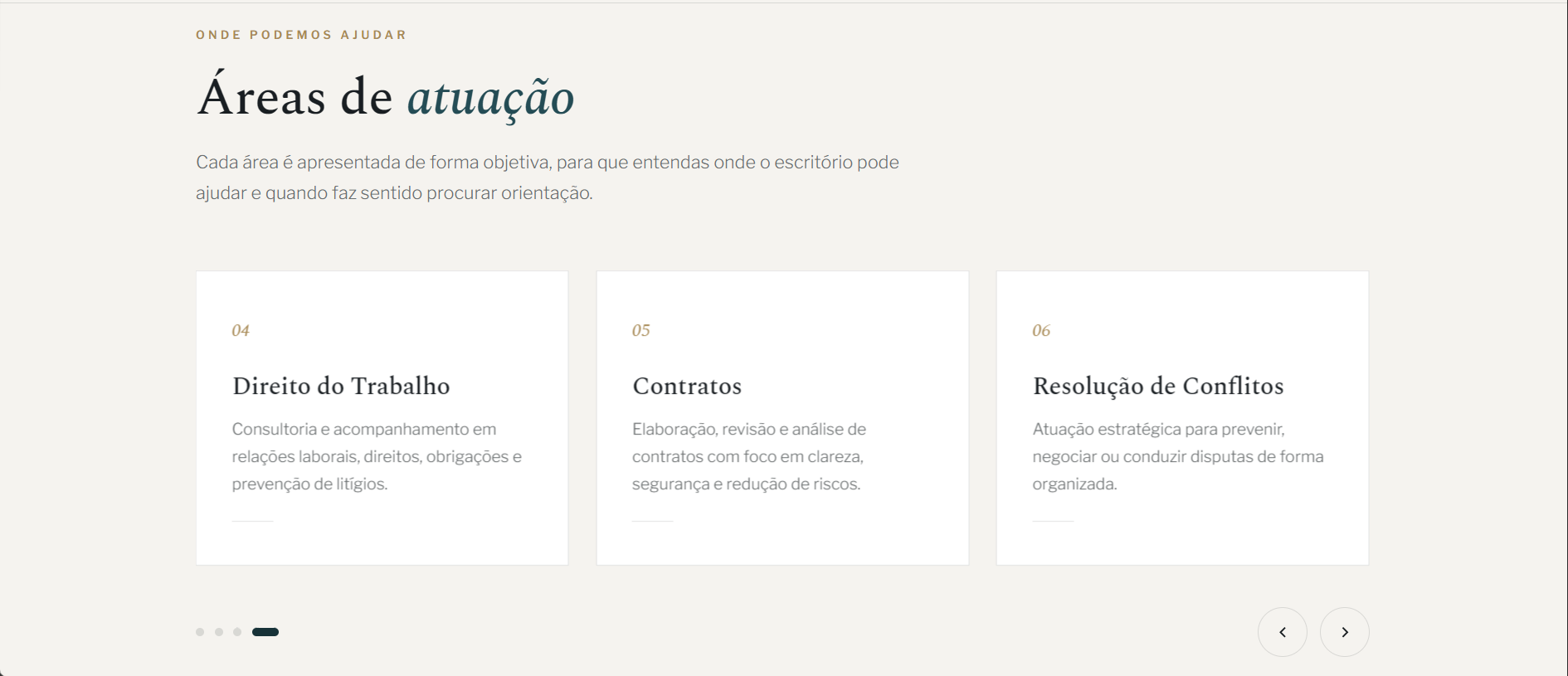
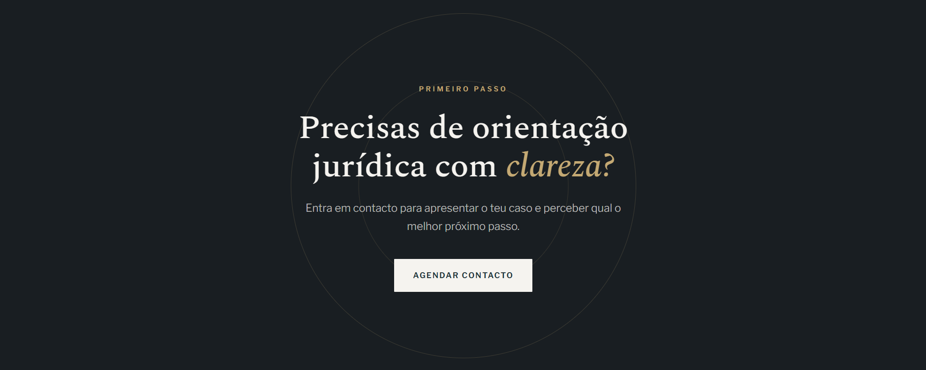
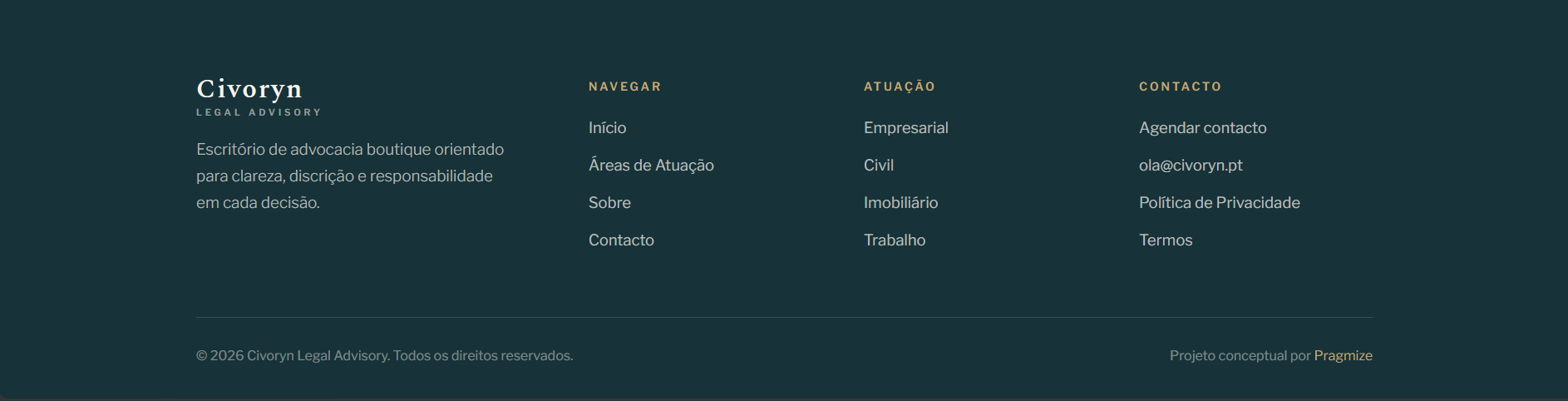
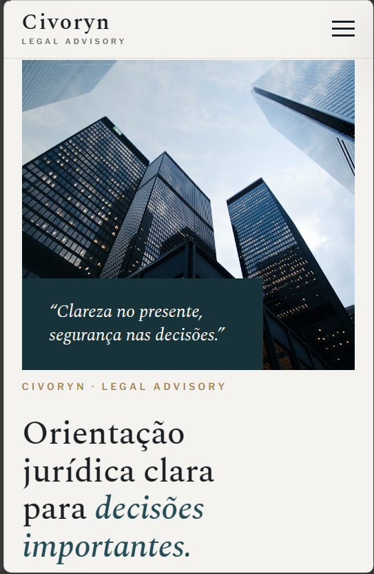
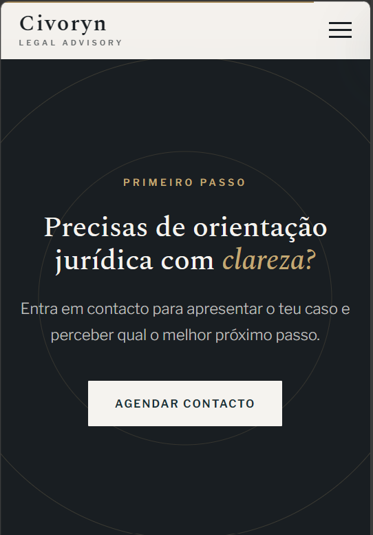
A redesign with a contemporary identity. Dedicated pages for each practice area (labour, civil, commercial, tax). Integrated consultation requests.
Marketing & strategy
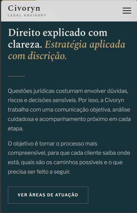
Bios rewritten around cases, not résumés. Sober editorial language. An "Insights" area to build authority.
Visual system
Palette
Typography
Spectral
Libre Franklin
Gallery — desktop
Gallery — mobile
Featured elements

Outcome
Consultation requests through the site doubled in the first 2 months. The team started sharing the link in their signatures.
What we learned
Professional-services clients look for signals of quality, not more information.
Next project
Dermae
Health & wellness
Have a similar project in mind?
Tell us your brand's moment and what you want to build.